Color Trends for 2026
Color Trends for 2026: What’s In, What’s Out, and What It Means for Your Home
Every year brings new color trends — but 2026 feels different. For the last decade, design influences often swung between bold experimentation and minimalist neutral palettes. In 2026, the movement is toward calm confidence: colors that feel grounded, intentional, and deeply human.
If you’re planning to sell, renovate, or just update a room, understanding color trends isn’t about chasing style — it’s about choosing colors that feel current, versatile, and welcoming.
Let’s dive into what 2026 is bringing — and why it matters.
A Shift Toward Emotional Comfort
The last few years have been marked by high-intensity palettes and dramatic contrasts. But in 2026, the trend is shifting.
People are seeking stability in their environments. That doesn’t mean bland interiors — it means color choices that support emotional comfort and timeless appeal.
Design professionals are calling this trend “grounded sophistication”: colors that are rich without being overpowering, warm without being fussy.
These palettes are not just stylish — they are practical:
They photograph well
They create a sense of serenity
They play nicely with light in most homes
They appeal to a broader range of buyers
If you’re selling soon, that last point matters more than ever. Color that feels too trendy can narrow appeal; color that feels intentional and calm can expand it.
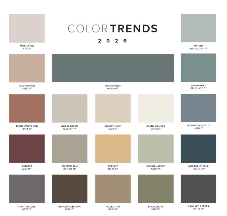
The Standout Colors for 2026
Here are the color families that are emerging as the 2026 favorites — and why they’re worth considering:
1. Soft Earthy Neutrals
Not the washed-out beiges of the past, but richer, more dimensional tones.
Think:
Warm greige
Clay-infused neutrals
Muted taupes
Dusty sands
These tones provide a calming foundation in living spaces, kitchens, and bedrooms, and they pair beautifully with both light and dark finishes.
Why they’re trending:
They anchor spaces without dominating them. They feel intentional and timeless — a key advantage if you’re selling or staging.
2. Muted Greens and Sage Tones
Green isn’t new, but the 2026 version is softer, more subtle, and more nature-inspired.
Expect shades like:
Sage
Moss
Soft eucalyptus
These colors add depth without feeling loud. They work beautifully in both traditional and modern interiors.
Why they’re trending:
People want a connection to nature indoors. These tones bring a hint of the outdoors inside without overwhelming a space.
3. Warm Clay and Terracotta
2026 takes terracotta beyond accent tiles and pottery.
Richer clay-inspired walls are emerging — especially in dining rooms, entryways, and accent walls.
These colors add warmth and personality without feeling dated.
Why they’re trending:
They evoke craftsmanship and comfort. They ground a room, making it feel both rich and approachable.
4. Deep Charcoal and Moody Blues
While neutrals dominate, 2026 also embraces intentional darkness — not black, not stark, but deep and thoughtful.
Charcoal gray and moody navy are showing up as accent walls, cabinets, and trim.
Why they’re trending:
These tones create contrast without harshness. They bring definition to spaces while still feeling calm.
What’s Fading Out
As 2026 approaches, certain palettes are receding from trend momentum:
Extreme high-contrast black-and-white schemes — they feel colder and less inviting.
Ultra-bright primaries — they’re energetic but hard to integrate into broader design schemes.
Pastel overload — soft pastels have their place, but as primary wall colors, they feel less grounded than earthy tones.
The overall mood of 2026 favors intentional, composed color over loud statements.
How to Choose Colors That Last
Whether you’re remodeling for comfort or preparing your home for market, here are smart principles to use:
1. Start With Your Light Source
Natural light changes everything. A color that feels calm in morning sun may feel flat under evening light. Always test swatches in different lighting.
2. Think Beyond Walls
Color now extends into cabinetry, trim, and even ceilings. A coordinated palette helps spaces feel intentional rather than patched together.
3. Pair With Texture
Earthy neutrals and muted tones work best when paired with texture — natural wood, matte finishes, woven fabrics. Color + texture = depth.
4. Aim for Flexible Appeal
If you’re selling, choose colors that enhance light and space. A thoughtful neutral or soft, muted tone can help buyers project their own style into your home.
Color + Market Reality
Here’s where color trends intersect with your real estate goals:
Staging matters: Well-chosen colors help rooms photograph better — critical in online listings.
Buyer perception: Calm, coordinated palettes make spaces feel larger and more inviting.
Resale flexibility: Neutral doesn’t mean boring — it means broadly appealing.
A perfectly styled room that feels warm and tailored does more for buyer confidence than the most expensive finishes.
Final Thought
Color isn’t just decoration. It’s emotional context. In 2026, the trend is toward palettes that make people feel comfortable, grounded, and connected to their spaces.
Whether you’re updating a room for your own enjoyment or positioning your home for sale, choosing color with intention — not impulse — is what sets good design apart.
If you want practical examples, paint pairings, or staging strategies tied to these 2026 trends, I can help with that next.
A quick practical tip: Most major paint brands now offer free apps that let you upload a photo of your room and digitally apply different paint colors to the walls. It’s an easy way to see how a color will feel in your actual space before committing. These apps also highlight current and upcoming color trends, which can be helpful if you want a modern look but aren’t sure where to start.
— Kim Douthit
Realtor, KW Relocation Cincinnati
📞 513-520-6091 | ✉️ [email protected]
